5 Proven Book Cover Design Tips to Boost Your Amazon KDP Sales!
5 Simple Tips to Make Your Book Cover Stand Out on Amazon (Even If You’re Not a Designer).
If you want your book to stand out on Amazon, your cover matters more than you think.
It’s the first thing people notice — especially when they’re scrolling through tiny thumbnails on their phones.
In this post, I’ll share 5 simple, beginner-friendly cover design tips that can help you get more clicks and sales — without hiring a designer or buying expensive software.
These tips are especially useful if you’re publishing kids’ books, workbooks, or coloring books.
Let’s get into it.

🎁 Download 15 FREE KDP Interior Templates
Save time and create beautiful low-content books faster with these 15 ready-to-use KDP interiors — completely free! Perfect for journals, planners, and activity books.
1. Use a Bold, Eye-Catching Dominant Color
The main color of your book cover plays a huge role in whether or not someone notices your book.
When people are browsing Amazon (especially on mobile), they only see a tiny version of your cover — so your dominant color needs to pop.
- For kids’ books, bright colors like yellow, red, or orange often work best.
- For other genres, choose a bold color that fits your audience — like blue, black, or teal for more serious or professional tones.
🎯 Tip: Scroll through your book category on Amazon and see which colors jump out at you — and which ones blend in.
How I Quickly Find Profitable KDP Niche Ideas Using Titans Pro
You may like this post where I shared a simple yet effective way I use to find low-competition, profitable KDP niche ideas fast!
2. Choose Big, Bold Fonts That Are Easy to Read
After the main color, the next most important element is your book’s title, which should immediately tell potential buyers what your book is about.
Therefore, it should be instantly readable—even at thumbnail size.
- Use big, bold, sans-serif fonts for your main title.
- Pair it with a smaller, matching font for the subtitle and author name.
If you’re designing for kids, fonts like Anton, Poppins, and Montserrat work great.
🆓 You can find free fonts here:
✅ 3. Add a Hero Image That Reflects Your Book’s Content
Now that your potential buyers have already read your book title, it’s time to show a matching visual to reinforce the content of the book.
In other words, your cover should visually communicate what the book is about—and fast.
Here are a few examples:
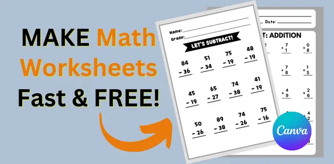
- For a kids’ math workbook, use 1–3 sample interior pages as your hero image.
- For a coloring book, showcase a large coloring page with complementary elements like crayons, happy kids, or doodles.
Avoid using random clipart or vague icons. Show the actual value of your book.
Related Post: How I Made $990 Selling 6 Medium Content Books On KDP!
4. Add Shadows, Shapes, and Text Effects for Depth
Flat covers can often make your book look homemade or unprofessional, which can hurt your chances of attracting buyers. A flat design usually lacks contrast, depth, and visual interest—making it blend in rather than stand out.
To fix that, you can add layers and depth to your design. This makes your cover look more polished, engaging, and bookstore-quality. Try using effects such as:
- Drop shadows on your title text
- Outlines or borders around your images
- Light gradients or background shapes
These small tweaks can make your cover look much more polished and dynamic — even if you’re using free tools like Canva or Affinity Designer.
5. Always Create Multiple Versions Before Finalizing
Don’t settle for your first design. Even if it looks “good enough,” your first attempt is rarely your best. The strongest book covers usually come from experimenting with multiple ideas before deciding on the final version.
Instead, try this:
- Create at least 3–5 different versions of your cover
- Swap out fonts, colors, images, or layout styles
- Preview each version at full size and thumbnail size
You’ll often be surprised by which version actually looks best when scaled down.
Final Thoughts
Great book covers don’t require expensive tools or graphic design degrees.
With a bit of intention and experimentation, you can create covers that attract clicks and build trust with your readers.
I hope these tips help you improve your next cover — and if you’d like me to break down one of my own redesigns in a future post, let me know in the comments.
Thanks for reading — and keep creating.
Subha
Keep learning: Discover more helpful posts below to boost your KDP success.
Want to Publish Your First Amazon KDP Book the Right Way?
I created a beginner-friendly Amazon KDP course that walks you through niche research, book creation, and publishing — step by step.
👉 Access the Amazon KDP MasterclassPerfect for beginners starting with low- and medium-content books.


